1. Your Business Has Changed
If the website still represents the company you were three years ago, visitors are meeting the wrong business.
2. It Looks Poor on Mobile
Mobile usability is no longer an optional extra.
3. Your Competitors Look Significantly Better
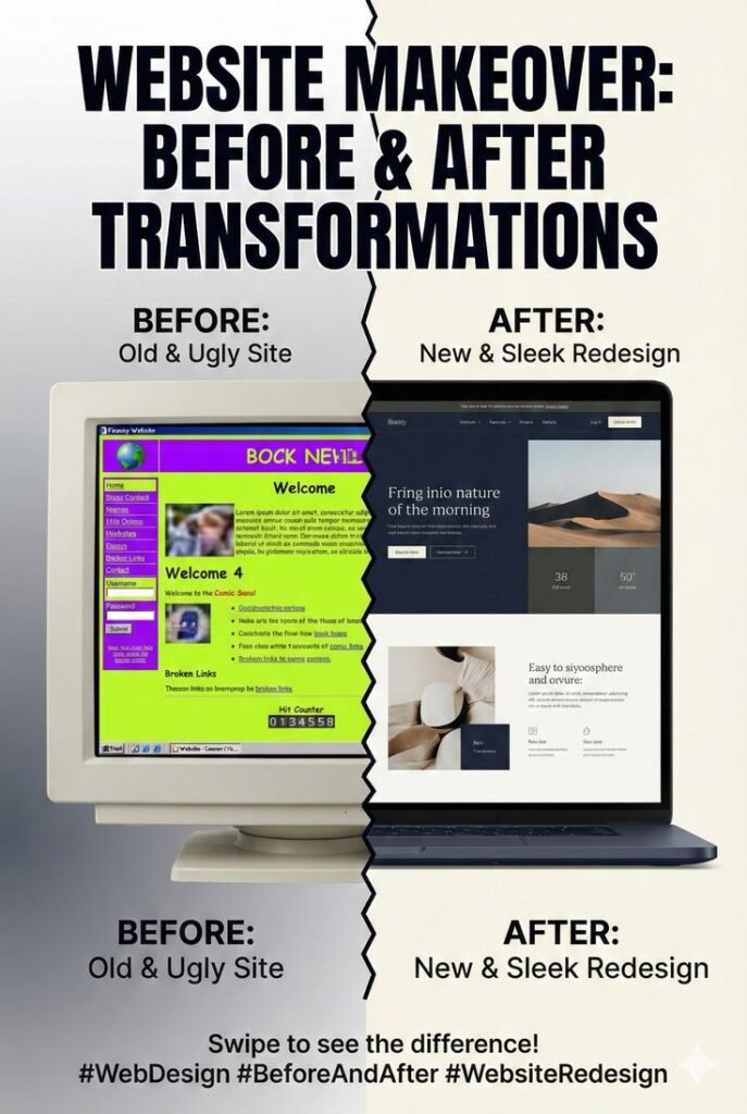
Design isn’t about winning beauty contests, but customers make comparisons.
4. Visitors Don’t Know What You Do
Clarity beats cleverness. Your offer should become obvious quickly.
5. The Website Is Slow
Large images, old themes and unnecessary plugins can create performance problems.
6. Updating Content Is Difficult
You shouldn’t need a minor engineering operation to change a telephone number.
7. Leads Have Declined
Traffic without enquiries can indicate issues with messaging, UX, trust or calls to action.
8. Your Branding Has Changed
A new identity sitting inside an old layout often feels awkward.
9. Navigation Has Become Complicated
Websites tend to accumulate pages over time. Eventually the menu starts resembling a filing cabinet.
10. The Site Wasn’t Built for SEO
Poor structure can make it harder for search engines to understand your content.
11. You Are Embarrassed to Send People There
This one is surprisingly important. If your sales team avoids sharing the website, something has gone wrong.
12. It No Longer Supports Your Goals
Perhaps the old objective was credibility. Now you need ecommerce, bookings, lead generation or international growth. Your website needs to evolve with that change.
Redesign or Rebuild?
A redesign may focus on visual presentation and UX.
A rebuild goes deeper and may change:
- CMS
- codebase
- structure
- functionality
- content architecture
The right option depends on what’s broken underneath.